Sunday, 4 February 2018

Ancillary Task: Album Magasine Posters

To help me understand in more detail what is typically found on a magazine album pester, I decided to analyse Lana Del Rey's and Lorde's campaign as they were the two artists that I had focused on most and had inspired my own artist.


Similarities:
Throughout both Lana Del Rey's poster and Lorde's poster, the key image is consistent in terms of all the feature the artist. This is consistent with what I found out in the codes and conventions of magazine posters. 
Also, each one features the name of the album in a bold white font. 
Each one includes where you can buy the album and it is typically in a smaller font in proportion to the rest of the font on the poster and is found at the very bottom of the poster. 
Each poster also has the logo of the production company. Although it is in different positions on each poster, it is always small and has a transparent edit on it in order for it to not take away from the aesthetic of the rest of the poster. 

Differences:
There is CGI used in Lorde’s poster to create a distorted effect and to use almost supernatural colours. However, this isn’t seen on Lana Del Rey’s album. This could be due to the fact that Lorde is recognised as being more unique and controversial around the topics she discusses in terms of drugs and alcohol etc. Considering the album is called ‘melodrama’; romances and breakups, this effect creates a more dramatic effect. On the other hand, Lana Del Rey conforms more to the stereotypical American classical aesthetic utilising more simplistic imagery to conform to her image. 
Lana Del Rey uses a mid-shot low angle shot in order to create an empowering female as the key image. However, Lorde uses a high angle shot of her in bed under covers, which again conforms to the typical breakup story of a female staying in bed feeling self-pity. Therefore, the key images are both related to the meaning of the album and brand image of the artist. 

How will this help me?
Overall, looking at Lana Del Rey’s and Lorde’s poster, I have realised that there are certain consistencies and codes and conventions I should conform to within my own product e.g. the key image of the artist, featuring the name of the artist and the album. However, there are also aspects I should challenge in order to create originality and to conform specifically to the image and style of the artist I am trying to create e.g. if there is CGI used, the type of key image and the extra information provided on the poster. 

Saturday, 3 February 2018

Ancillary Task: Codes and Conventions of Digipacks

To help me understand the codes and conventions of digipacks, I have decided to research existing products within the indie genre. This will give me a better understanding of what to include on mine when I create my own product. As Lorde Doesn’t have a digipack, I decided to research into Lana Del Rey’s digipack that she released for ‘Born to Die’.

The layout:
The slip case: The overall layout of the digipack is different to the conventions ‘cross template’. She featured a slip case that featured the cut out of ‘Lana Del Rey’ which showed the album cover through it. The back of the slip case was a continuation of the sky theme she utilised throughout the rest of the marketing campaign for Born to Die. Although Lana typically conforms to the typically marketing techniques as she has a very simplistic style, in this case, the addition of the slip case continues to be very simplistic but also allows the audience to instantly recognise the digipack as hers through the use so synergy of the imagery throughout her campaign. This is assisted by her iconic font that has been utilised to complete this.  Also, the change creates individualism and creates hype surrounding the digipack.


The digipack:
The rest of the digipack includes a three rectangular shape template meaning there are six faces including three sides, the front cover, the back and the CD holder.

The front cover: The front cover utilises the same imagery as the magazine poster that was created for this campaign and instead of having information about the album it says ‘Born to Die’. This again creates a consistency throughout the advertisement campaign for this album which can be recognised through the stencil cut out of the slip case.

The CD:

The digipack has a side in which the CD tray would go. This side has a blue background and has a long shot of Lana within the circle so when the CD is in the tray, the key image can’t be seen behind it. There is also a design for the CD itself, which again is a continuation of the theme throughout the rest of the digipack. Also, there is institutional information featured on the CD including the signature font saying ‘Lana Del Rey’ and the name of the album ‘Born to Die’. There is also the name of the record label on it.


As well as analysing Lana’s digipack, I thought I would look at different designs for digipacks that are often used:


The final template is the digipack template that is most commonly used in real life examples:


However, as I am creating my product within the indie genre, I could challenge codes and conventions of the digipacks as my target audience would appreciate it and chose a different layout. The third digipack I like as there are more sides in which you can fill with images of the artist. This would allow me to create a greater relationship with the audience as I can conform to Dyer’s star theory that utilising more coverage of the artist allows the audience to connect with them. 


Overall how has this helped me?
After analysing the codes and conventions of digipacks I have learnt:
There has to be a clear consistency throughout thee digipack in terms of the colour scheme and images used. It is also important for the digipack to have some sort of correlation between the images used on the poster and video also.
I now know that there is more than one type of template I can use to create my digipack which I will be able to choose once I have taken the images for it. I am able to use an alternative template as the indie audience enjoy difference and it would appear as a more unique style to the typical template.

Thursday, 1 February 2018

Ancillary Task: Codes and Conventions of Album Posters

To help me understand what the codes and conventions of an indie magazine poster are, I decided to look at existing indie artist’s examples. I tried to mainly find female examples but also thought it would be useful to look at male examples to gain a better understanding.


Artists name:
On every poster, the artists name is of the largest font of all text on the poster and placed at the top. However, in some cases is placed at the bottom or in the centre. the most prominent aspect and placed either at the top. The font is typically white and always in a bold font which is unique to their brand image. The font is typically bold and ‘block’ like as seen in the Lana Del Rey, Lady Gaga and Coldplay posters.


Album Title:
Typically, the title of the album is either positioned under the artist’s name or when the artists name is at the very top of the poster, the album title can be placed at the bottom with a key image in-between. The font of the album name is consistent with the artist’s name however; it is typically smaller.

Key image:
In each poster in which there is a key image, it is an image of the artist/band. There has been a close up (Ed sheeran), a head and shoulder shot (Lorde) and a mid-shot (Birdy) used. This can conform to Dyers star theory that an audience appeals to maximum use of images/shots of the artist. The background of the image is also typically a block colour or, in some cases, a landscape themed background.


CGI:
In five of the album posters, CGI has been utilised during post production. This can be linked to the fact that indie artists are often ‘unique’ in the way they brand/market themselves in order to keep up with an audience’s expectations; they constantly guess what the artist will do next.

In Lordes poster, CGI has been used to add tear like streaks down her face. This creates an almost supernatural effect which is contrasted by the crown she is wearing. The binary opposition created through the crown connoting wealth and power is juxtaposed by the supernatural tones which has connotations of evil and uncertainty. This can appeal to her target audience as it suggests that she is representing two sides in the image which could be a reflection of the music within her album. The audience are also aware she often sings about controversial/ sensitive topics so the unknown symbolism of the CGI on the album poster creates audience intrigue surrounding her music; propelling them to buy the album.


In Ed Sheerans poster, a filter has been used over the top of the album cover to create a grained effect. This creates shadows and more depth to the key image and hence makes him appear more eerie and sinister. This can appeal to his target audience as his music is typically more pop, however this album was classified as indie/pop/rock and therefore an audience would have been intrigued as it connotes a different style of music than he typically produces.


Extra information:
The extra information found on the album covers is not consistent throughout the examples I found. However, some of the information that is included throughout includes; the names of songs featured on the album (Lady Gaga), extra information around what is included with the album (Lana Del Rey), where the album can be found/downloaded (Ed Sheeran) and what format the album can be purchased on (vinyl-Birdy).

Other extra information that is featured throughout the posters is the date of release. However, this also varies throughout the examples. On some posters, they state the album is ‘coming soon’ and gives no specific date. This could be because it was released at the beginning of the campaign for the album to create initial hype. On other posters it gives an exact date of release which can also create audience hype.

How has this helped me?
Overall this has helped me as I now understand what is typically included when creating a magazine album poster and therefore I can apply what I have learnt when creating my own poster. The key ideas I learnt were:

The key image should be of the artist on either a block background or a background that conforms to the artist’s brand image (typically branding) or the album name/songs.
The font should be bold and white and the artists name should be the largest font with the album name of a similar size.
Any other information I want to include is a personal preference, there is no consistencies throughout each poster which is specific to indie album magazine posters.

Wednesday, 31 January 2018

Ancillary Task Decision

After looking at the briefs for the ancillary tasks:

I decided that the two I would choose to do would be:
  • a digipak for the album’s release
  • a magazine advertisement for the digipak.

I made this decision as I previous experience from GCSE media of creating album covers and magazine advertisements. This means the skills I learnt from this can be applied to creating this promotional package.

Although I have designed a website for an artist previously, I have never made a full functioning website.  I feel like it would, therefore, not be a true reflection of my skills as I would have to focus on the technical side of making the website function correctly.

Tuesday, 30 January 2018

Editing Session Six: Final Music Video

In the final editing session, we decided to act upon target audience feedback and concentrate on adding more creativity into the editing aspect of the video.

We began by changing two shots within the narrative which were a close up of the actress scratching her head and a long shot of two people sat on a bench. This is because we decided we needed to try to suggest the joining of the red thread to help to establish the theory. Therefore, we filmed a close up of someone tying a red thread to someone else’s hand. We also filmed a clip of two people with string around their hands who move away from each other so the string unwraps. When it came to editing this, we put the slip in reverse so it actually appeared as if the thread was wrapping around the two hands as they join together as one. I did this by using the reverse tool and also changing the speed of the clip to ensure it was long enough for the audience to understand what was going on.


We also decided to add a stop frame within the narrative. This occurs when the two female actresses who were originally in love have an argument and Luna leaves. The stop frame connotes how she was destined to stay and wanted to stay but she has to leave. We did this by blading the clip and overlaying each section as a layer.


We also added a series of light leaks as a layer over the top of the live performance clips. This conformed to the indie genre as it creates an almost retro vibe. We did this by adding the clip of the light leak over the top of the narrative clips and reducing the opacity to make it appear ‘see through’. We also made the light leaks red in the beginning of the narrative whilst the homosexual couple were together to connote love and passion. However, as soon as the two meet in the library, the light leak changes to blue to connote the loss of love between the original couple.

We also reimported the music to try and fix the issues we were having with the base.

Overall, after this session we have finished the music video. We ensured that the editing was more creative in terms of the technical aspects and tried to focus on effectively establishing the red thread theory again in the initial opening 30 seconds.  The final video:

Monday, 29 January 2018

Final Target Audience Feedback: Music Video

To gain specific target audience feedback on my music video I completed a survey on Survey Monkey. This allowed me to ask specific questions so I could categorise the responses. For example, the first three questions I asked were: ‘How old are you?’, ‘What gender are you?’ and ‘Do you enjoy the indie music genre?’. This meant that based on the responses, I could filter them to ensure the responses I gained were within the correct target audience I had created the product for.

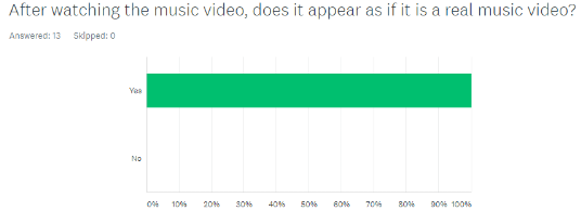
Overall I gained 20 responses from the survey however after I filtered the results for: both males and females, ages 16-25 and people that did enjoy the indie genre there were only 13 responses. The first question I looked at after this was ‘After watching the music video, does it appear as if it is a real music video?’ and out of the 13 responses all of them said ‘yes’ which assured me that the music video conformed to codes and conventions like we had set out to achieve.


The next question was: ‘Do you understand the music video?’ and out of the thirteen responses 11 of them said ‘yes’ and the other 2 were ‘no’. Although not everyone replied with yes, the narrative we created was intentionally complex and is not a passive text, it has to be decoded carefully and therefore I expected there would be some people that did not understand it.


The next question was ‘What is your favourite part of the music video?’ and some of the answers included; ‘the library scene’, ‘the costa date’, ‘the read thread theory’, ‘the part where they had ribbon on their fingers’, ‘the singing’. The most common answers were the library scene, the Costa date, and the red thread theory which all had two comments each. One person said ‘ALL OF IT I LOVE IT ALL’ and there were two comments surrounding the editing. This was a surprise as I thought that less people would identify the red thread theory as their favourite aspect as it is subtler but I am pleased with the feedback as majority of it is complementing the changes I made based on the previous feedback I gained.


The next question was what do you not like the music video. The answers included: ‘I think the start was a bit confusing but just a bit’, ‘The bit with the other couples confused me? I don’t understand the relevance’, ‘Some parts weren't clear and could be misunderstood’ and the rest of the ten responses said ‘nothing’. Although it is negative that some people didn’t understand the beginning of the video, this was what we expected as the narrative is meant to be complex. Also, the fact that some people said their favourite part was the red thread aspect (the beginning part they’re referring too) means that there is a mixture of those who do and don’t understand. This can be due to the fact that some of the have specific psychographics of complex narratives and symbolic codes whereas other don’t.


The final question was ‘is there anything you would change?’. Four of these responses included ‘nothing or no’ and one said ‘Music was very bass-y at times, to the point where it vibrated my speakers a lot making the vocals a wee bit harder to hear’. After listening to the music video again, I haven’t heard this issue personally and considering no one else mentioned this, I assume that this is an issue on the device the person listened to the video on and therefore there is nothing I can do about.


Overall, after collecting this feedback, I know that the music video I created conforms to the codes and conventions of music videos and it appeals to the target audience I tried to attract. Although some members of this audience were confused about the beginning of the narrative (the red thread) this was expected as the music video has subtle symbolic codes that the passive members of the audience would not decode. However, a lot of people also did understand it meaning the encoding of the red thread theory was still effective.

Friday, 26 January 2018

Editing Session Five

In this editing session, I am finishing the editing based on the outcome of the target audience feedback. In this season I will focus more on the editing in time with the music and change the clip that was considered ‘awkward’ in the sequence.
  • I began by zooming in closer in the audio bar for the music video audio and the audio from the song that we played during the live performance shoots. I then looked for peaks and troughs in the real music video audio and bladed the audio in these places. This made it easier for me to see where the clips should be cutting. I then went through the sequence and extended or shortened the visual clips in accordance to the blading. This allowed me to emphasise the beat more and make the editing seem more ‘sharp’. I specifically focused on the part of the clip where the two females are sat on the sofa together. 


  • In terms of the clip, I replaced it with another clip that I had from the live performance. So that she had the microphone in the right hand. 


This is the music video after this editing session: